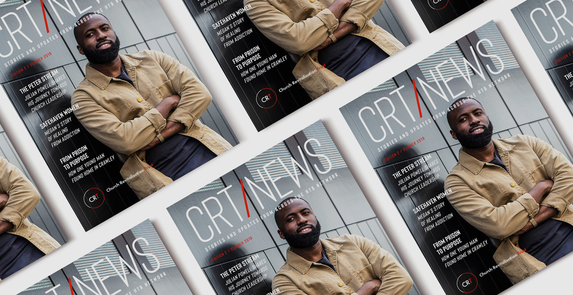
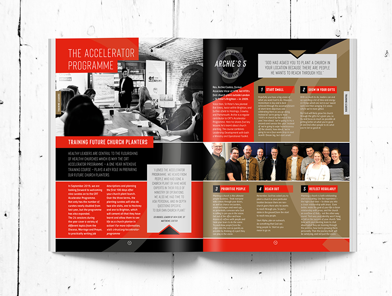
Approached to develop the brand and create from the ground up a news magazine, it was a a great opportunity to get back to where it all began 25 something years ago back in Barcelona, design for print.
Working with layout design for a magazine is completely different to anything online, templated or not. Print needs energy in the design to carry the reader through 28 pages of images and text and each spread needs to make them feel calm and enjoying the experience as they are navigated through the content. Part of the solution is to leave the reader wanting to see the next page and to keep hold of the magazine to dip in and out of at a further date.
To see the full story click on here. Thanks.


