What a delight to work with this team of dynamic ladies. Great to be involved with people that are a part of bringing true social transformation and change to so many lives. If you want to know more digitally shout!
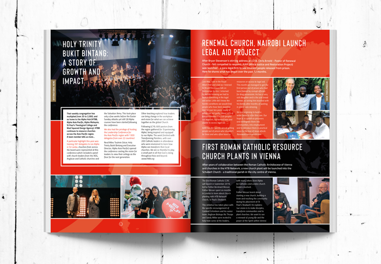
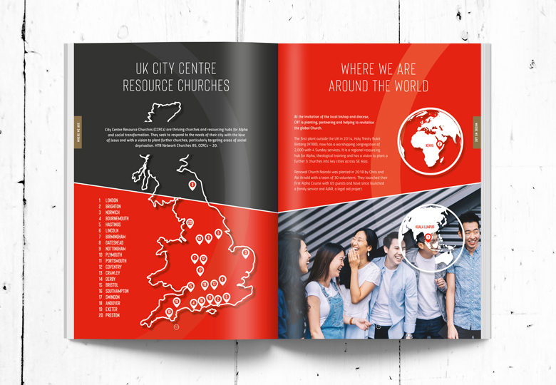
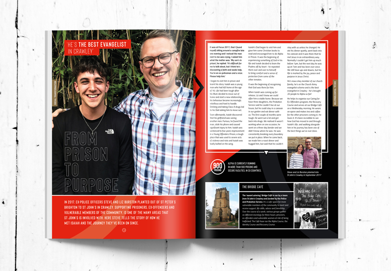
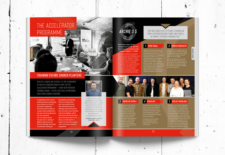
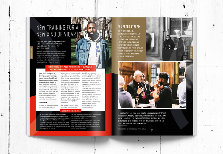
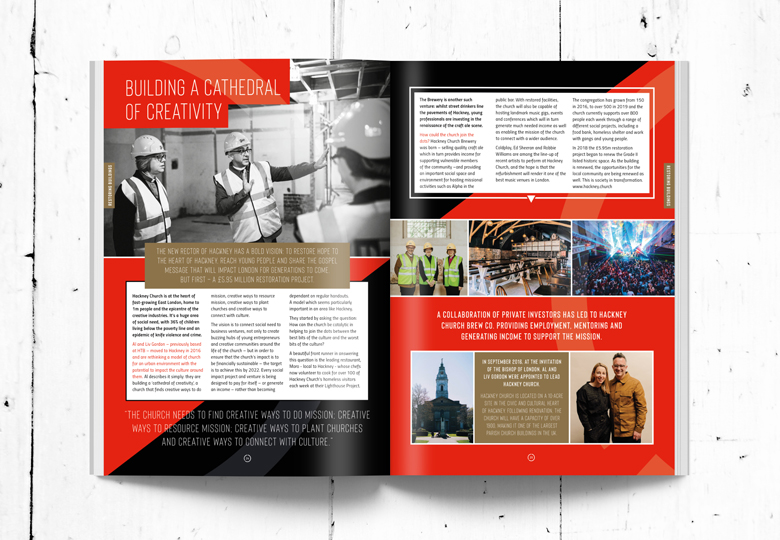
Approached to refresh the brand and apply through designing the second edtion of their news magazine it was great to be back where it all began, print!
There is a huge difference between designing for print and digital. Digital is mainly restricted by online templates, like a colour within the lines exercise. Lots of younger designers (I’m 98) don’t have this experience as all they have known is the diluted ready made layouts in a digital world driven by ease and speed and no room for a creative eye. Similar to fast food these are becoming more and more the norm, but it’s unhealthy for your brand. You’re blending in with the noise.
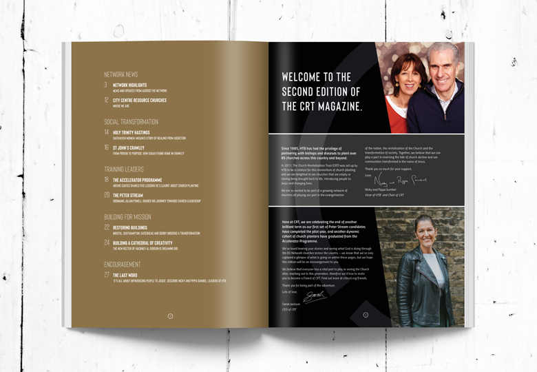
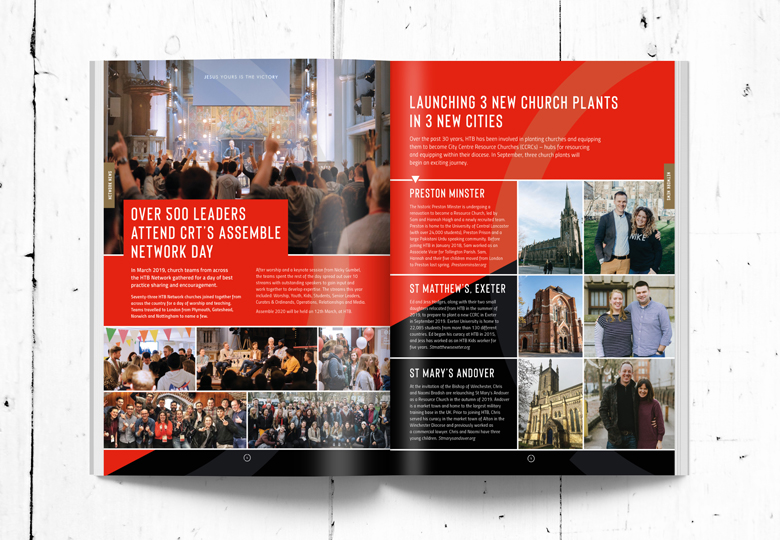
Sorry I love a digital rant when nobody is listening. OK I’m back, as I was saying it was great to dive back into print layout. The dynamics of making design work across a spread using the tricks of the trade to guide the reader’s eye where you want it to go, in the order you determine, are all part of the challenge.
The content was interesting, this always helps your creativity, and spread by spread, the magazine came together with a new lease of life breathed into it. A change of fonts to allow for more variations was needed. This is quite important in print as opposed to straight forward online layout.
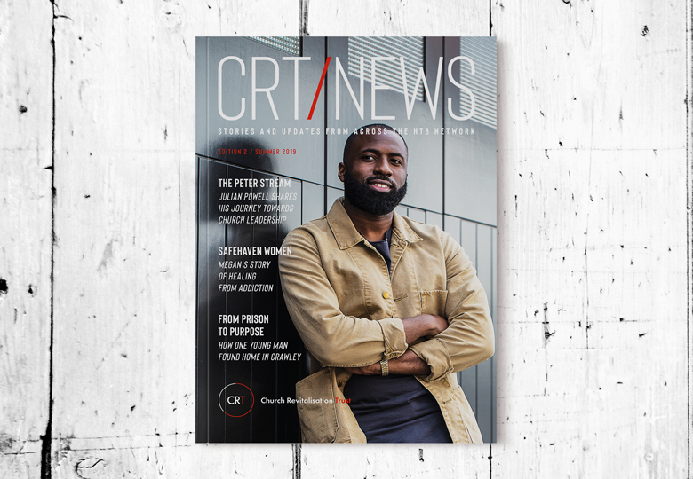
The last part was the front cover. I had to wait until all the spreads were completed to get a feel for what was needed for the cover. Photographing Julian Powell was the icing on the cake. Within 10 minutes the shot was in the bag and it just felt right.
The magazine was a huge success with incredible feedback from so many people.
Getting to see brands thrive is what I get out of it. It’s important that my clients are happy and I bring them the change through design they require so their products and services stand out, engage and bring home the ‘bacon’.
