A wonderful team of people to work with, utter delight and full of laughter.
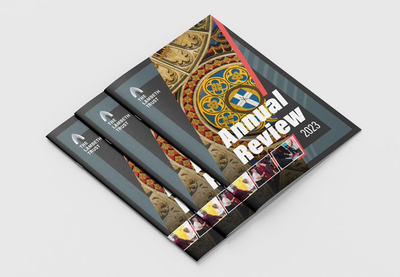
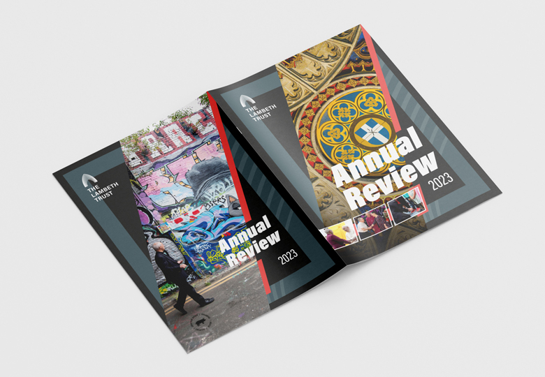
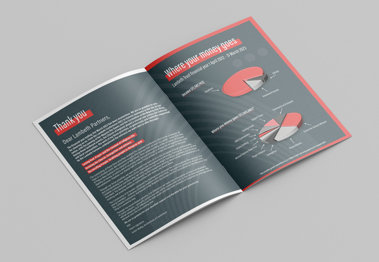
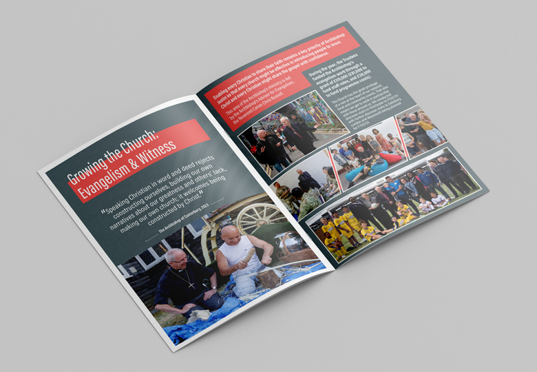
Lambeth Palace approached me to design their annual report. Do you have any colours? A font you use? Any brand at all? The answers were all a no.
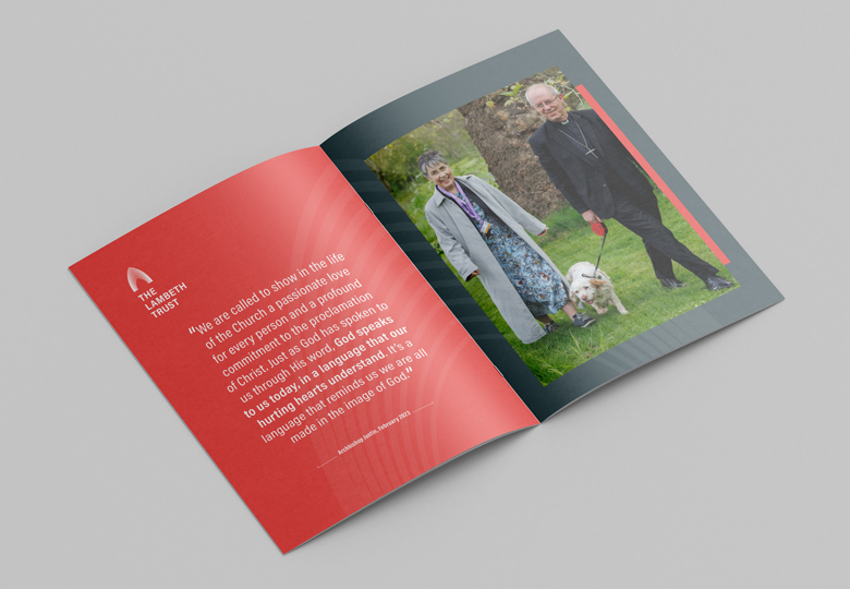
So I started working with colours and fonts that gave the design to be the right voice and then from that built the look and feel to engage with as many different age groups as possible.
It needed to be vibrant, refreshing and full of energy to reflect the hard work that The Archbishop and his team put into everything globally in a year.
They love it.
