A great opportunity to showcase the St Mellitus brand refresh I began a year ago.
This prospectus needs to engage with a large audience of people from all walks of life. Therefore it should show the heritage of the brand to gain trust, and have an appeal that’s fresh and down-to-earth to make it accessible. Not stuffy and old fashion.
Brand identities need to change their ‘tone of voice’ visually when needed and as this is client facing and for many, the first time they’ve come across St Mellitus College, first impressions count, so clarity of design was key. When your brand speaks make it easy for your audience, don’t send them hunting around the pages, they won’t tolerate 5 seconds of that, and you lose them.
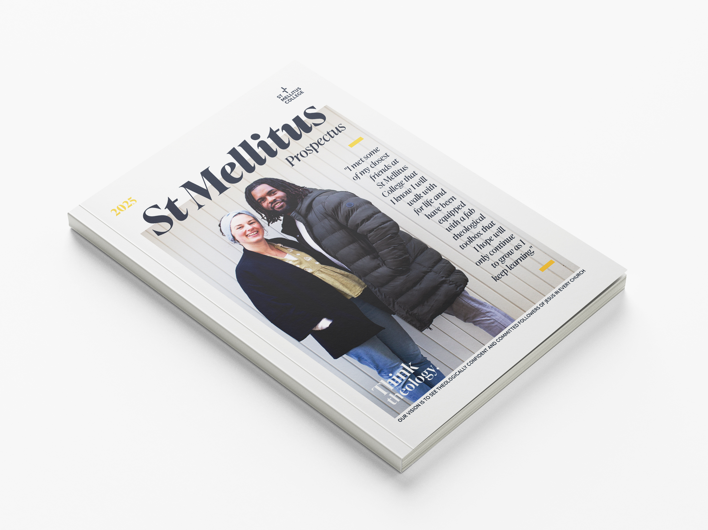
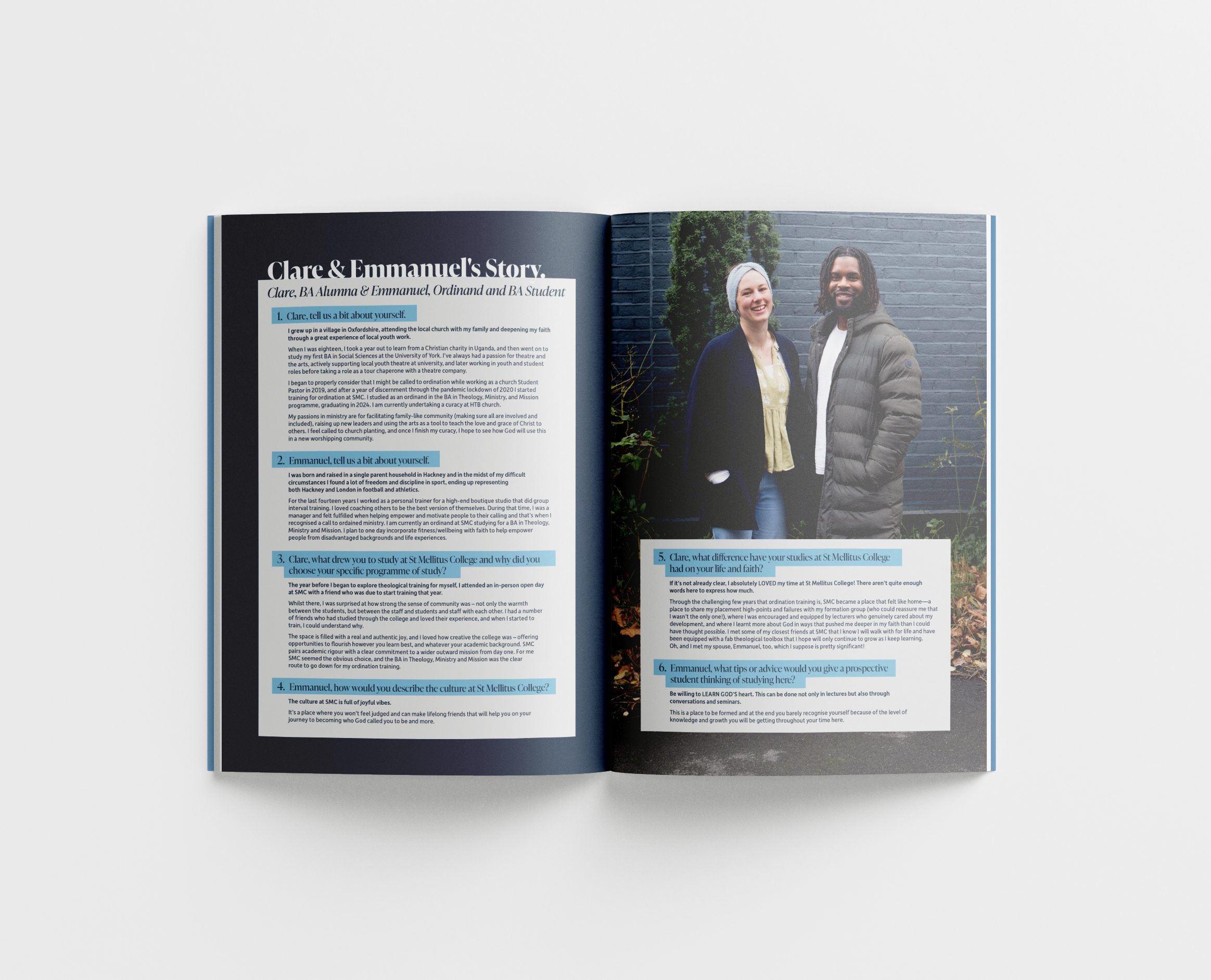
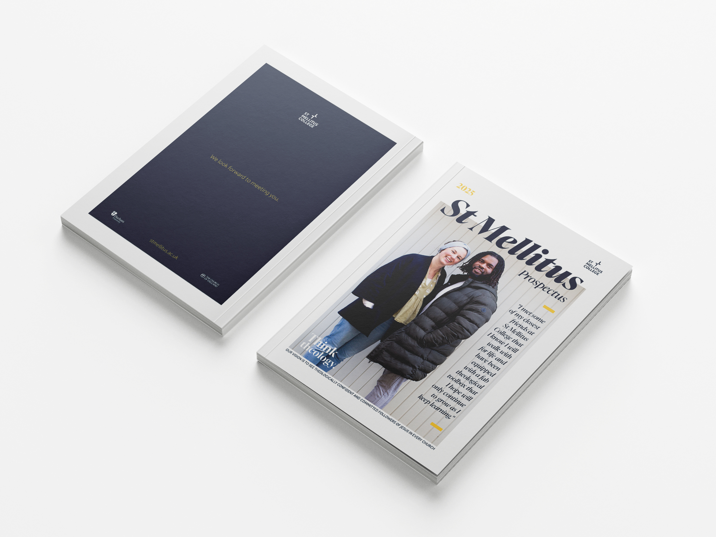
Choosing to photograph Clare and Emmanuel for the front cover and then link them through to their own story inside brings further detail and substance to the brand story.
Disclaimer: (slide 7 are not my photographs).