A couple of years ago I created an advertsing campaign to go on billboards around parts of London.
They were seen by the CEO of a large leading crane hire company that has been operating successfully for over 25 years. They work with huge companies on projects across the country and are really nice genuine people to work with.
He got in touch recently to discuss creating a brand identity for an additional new company he is setting up that will cover smaller domestic and commercial projects.
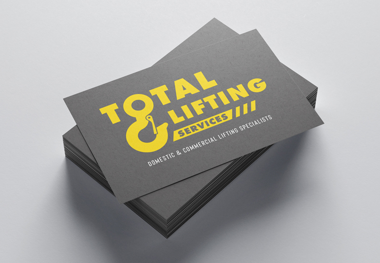
The benefit of this is that clients get the same 25 years of professionalism, experience and safety meaning it removes the risk to you the client from dealing with those who have not ‘lifted’ their standards and are a risk to you and your project.
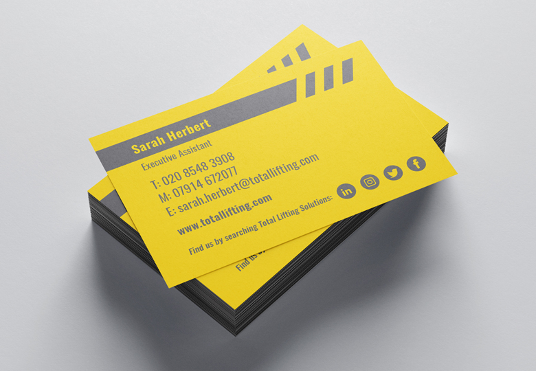
The new logo needed to reflect this and come across accessible and not look a ‘too big for your job company’ which would deter the audience he wants to connect with.
Branding and design is about simplicity and clarity. If an agency needs to write a stack of ‘creative buzzword blah’ to explain to you their design then they’ve been too indulgent and forgot about who ultimately needs to get it and engage within a split second, and alas that creatvie blah won’t be about to explain it so you will lose potential clients.
Simplicity and clarity = memorable when the client comes to need your products or services.


